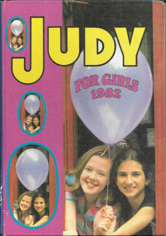
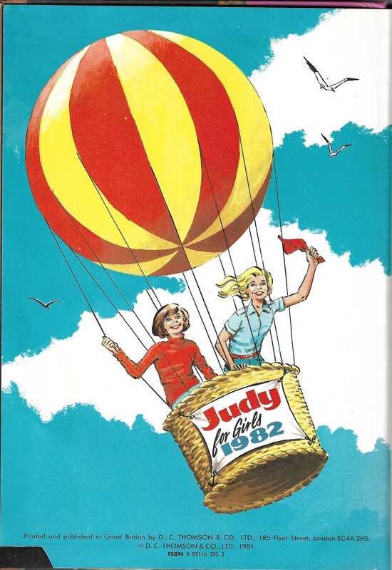
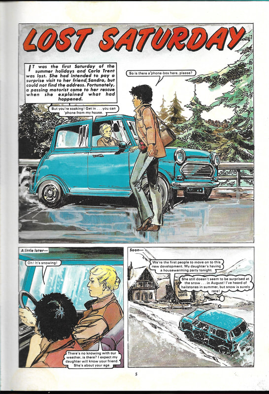
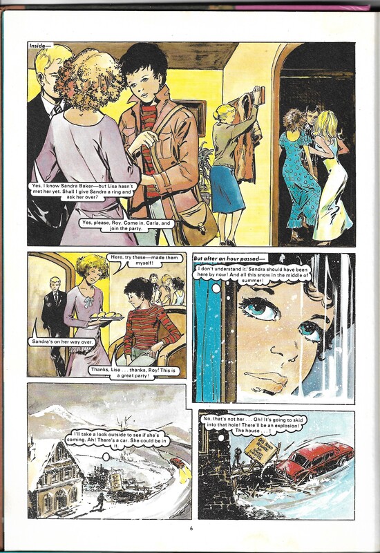
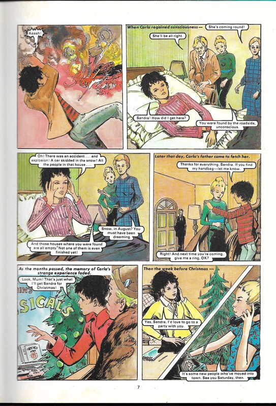
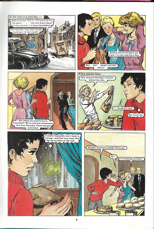
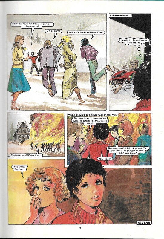
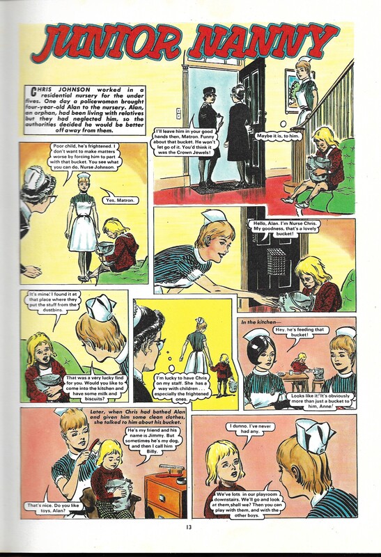
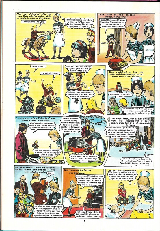
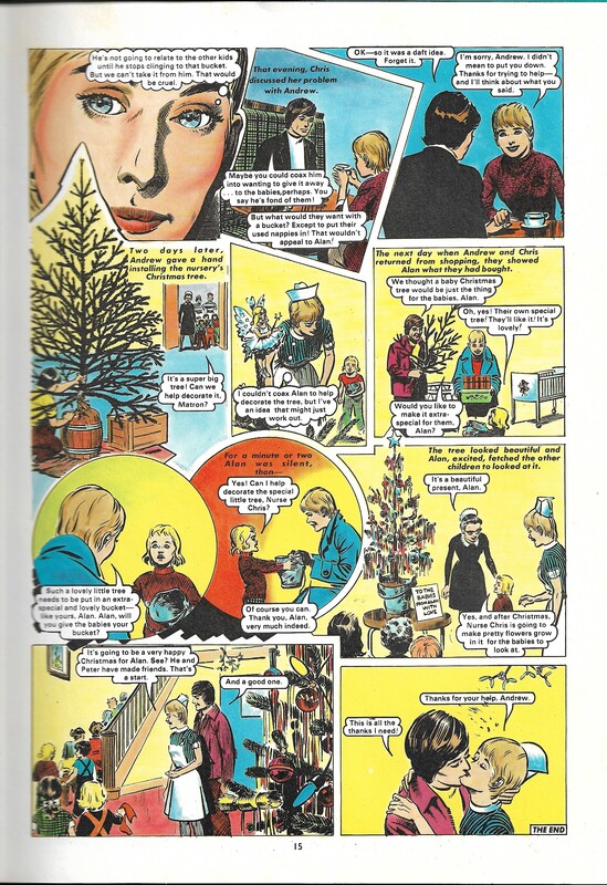
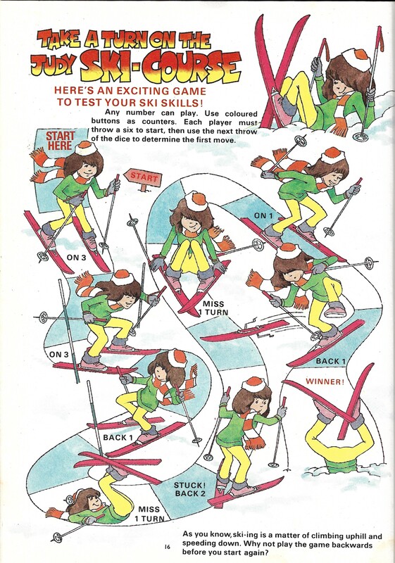
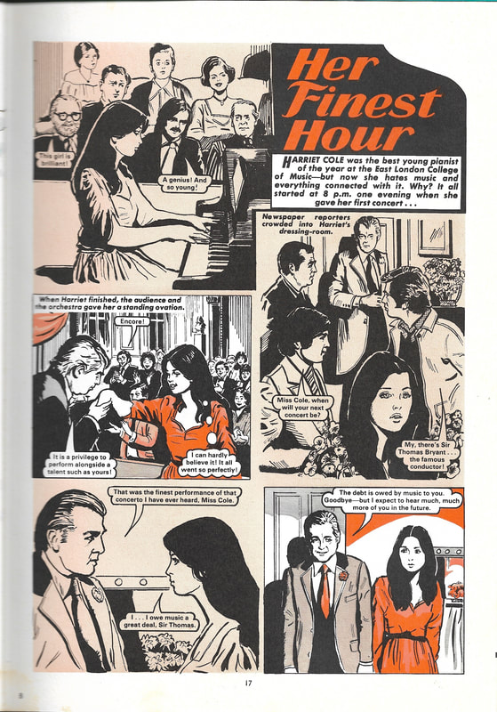
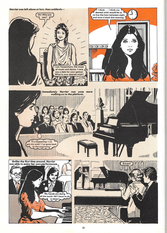
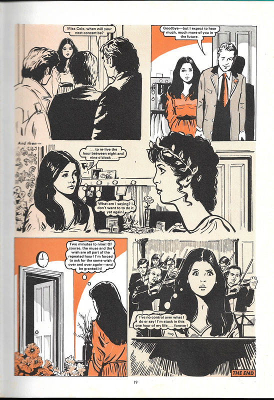
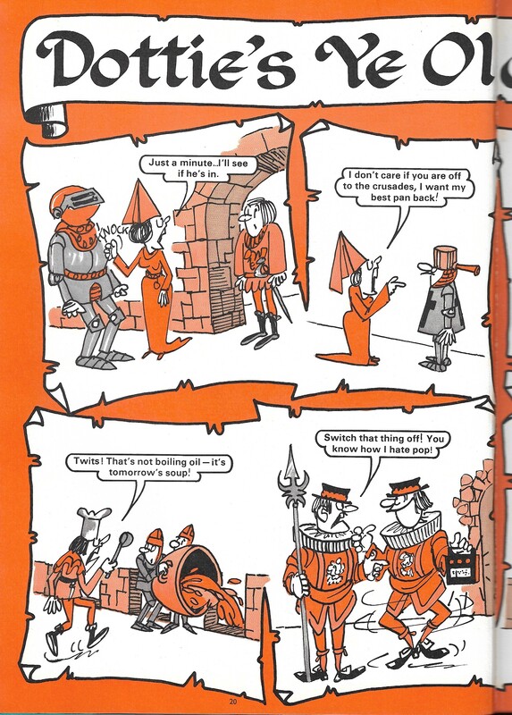
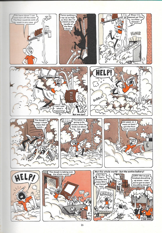
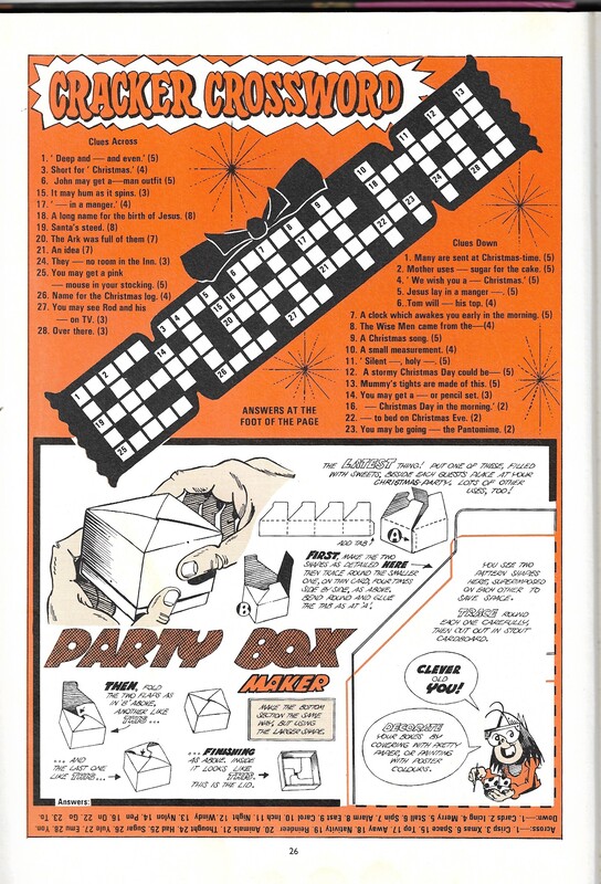
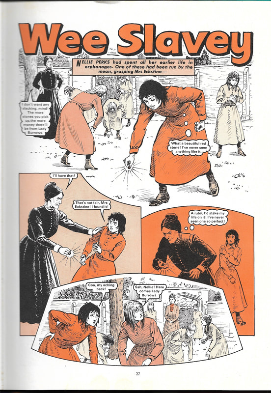
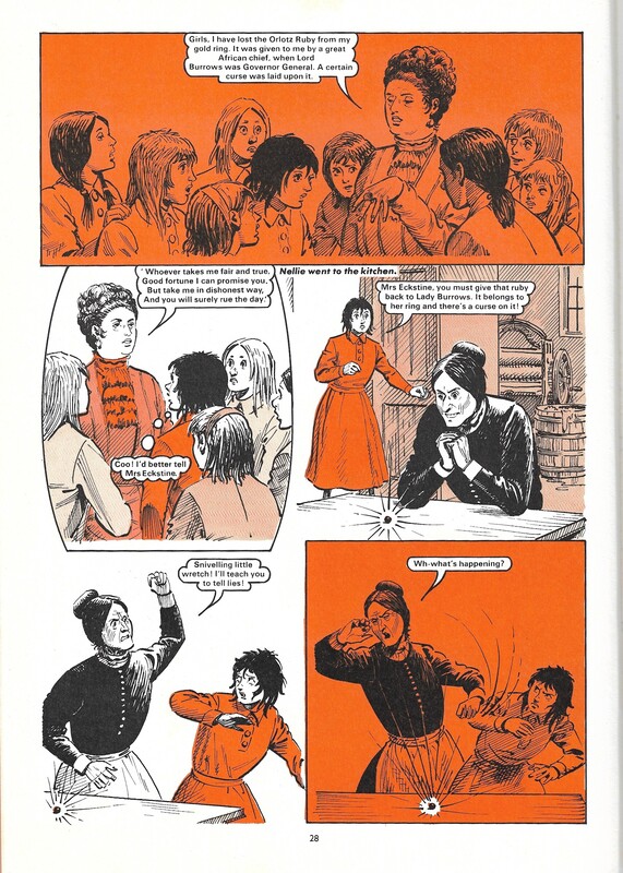
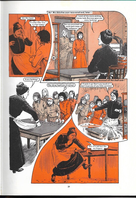
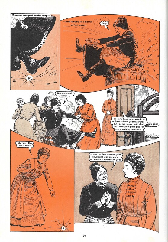
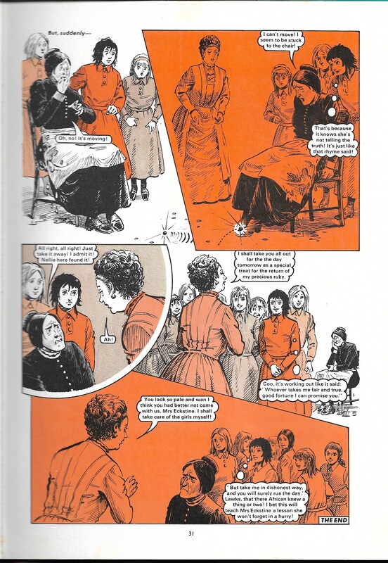
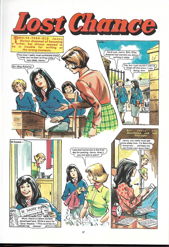
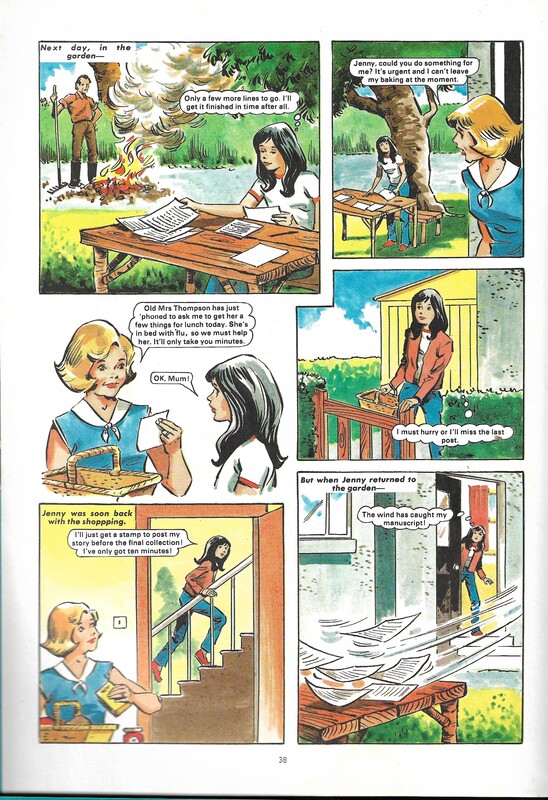
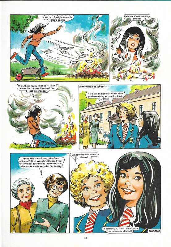
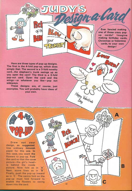
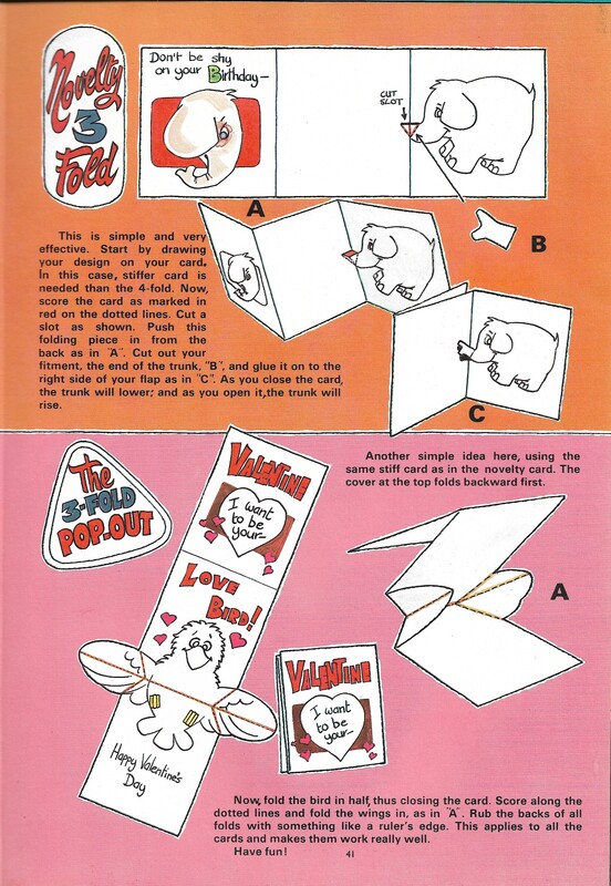
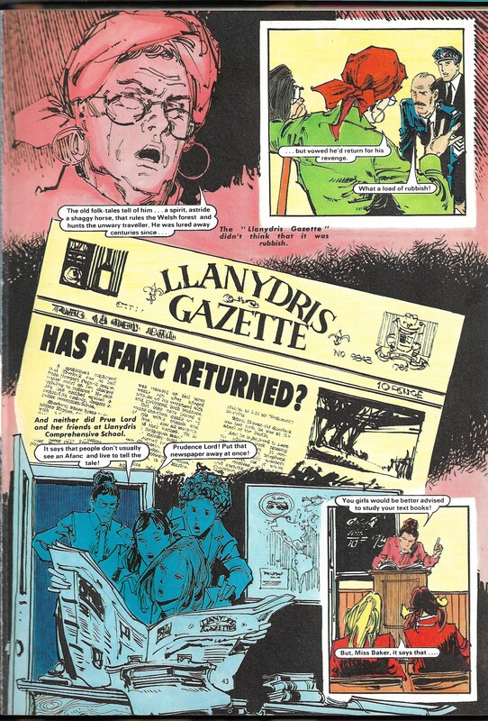
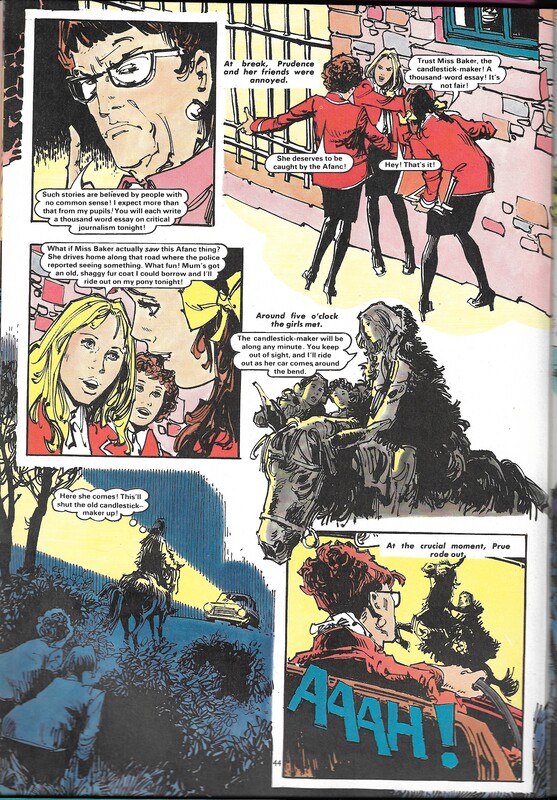
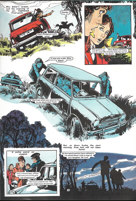
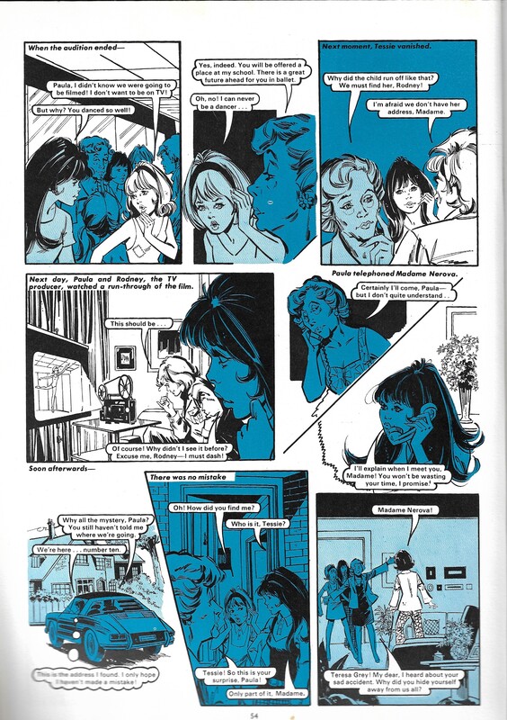
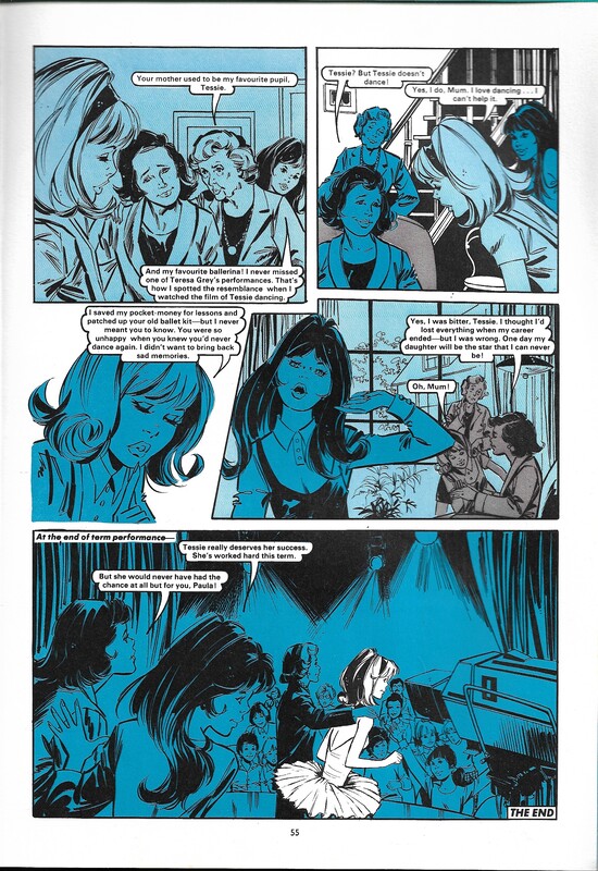
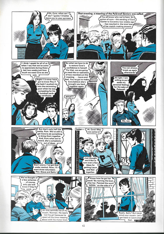
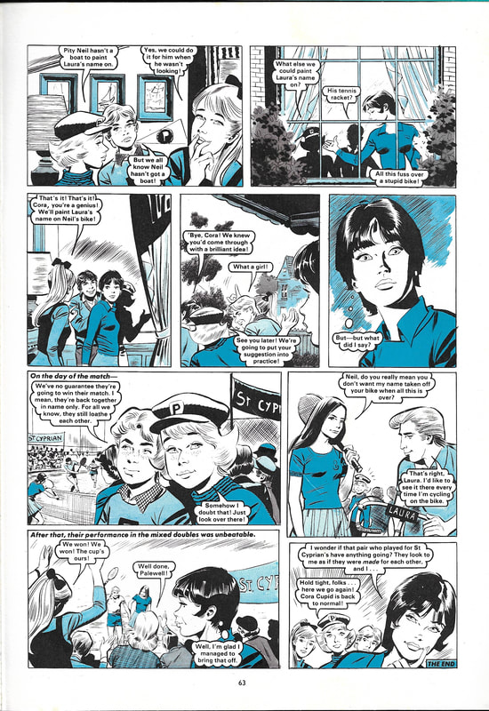
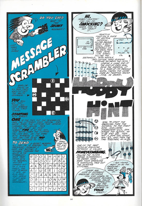
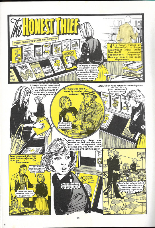
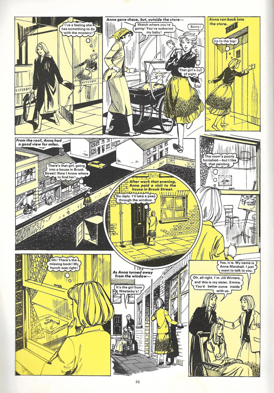
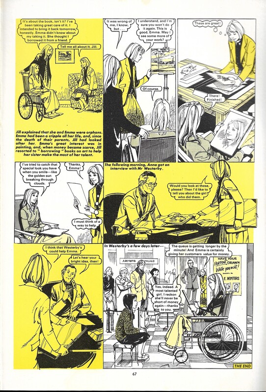
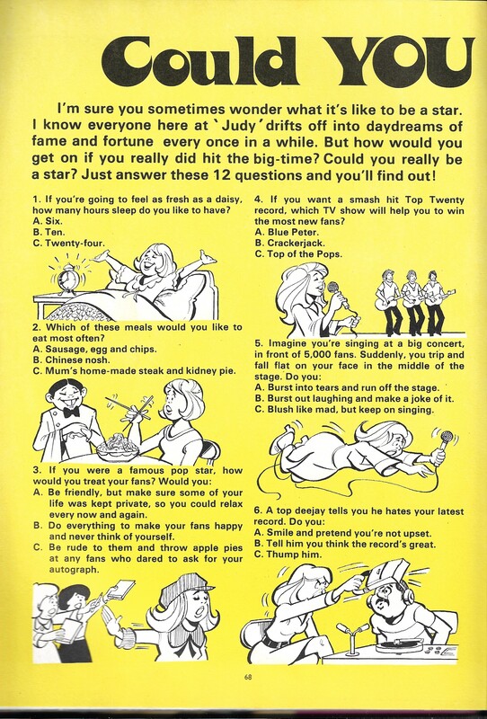
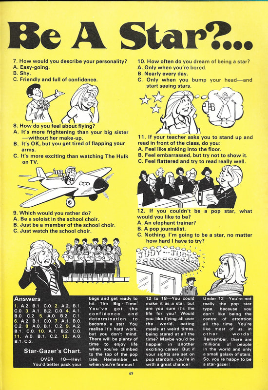
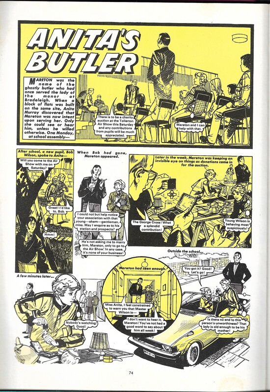
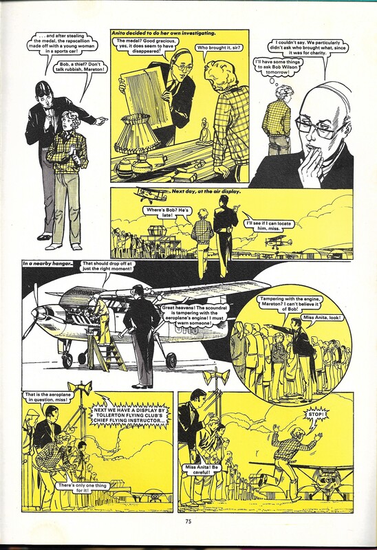
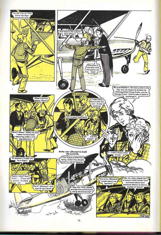
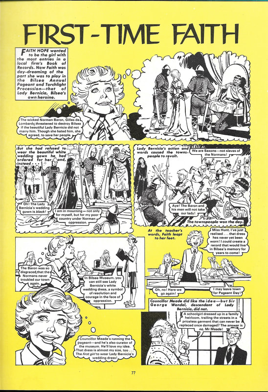
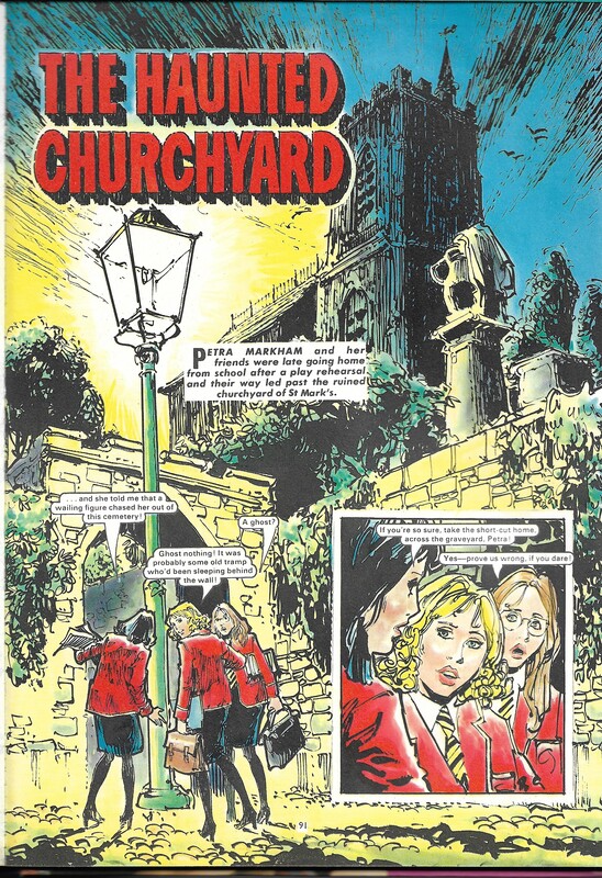
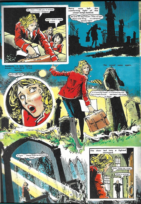
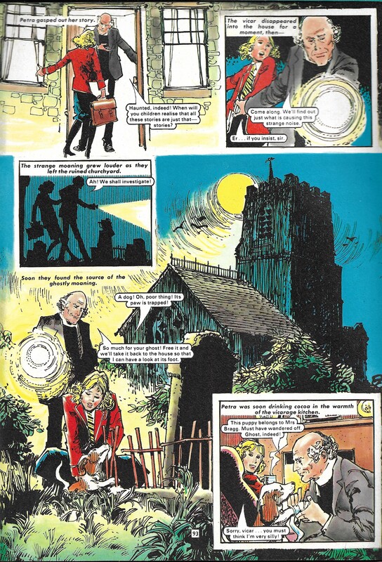
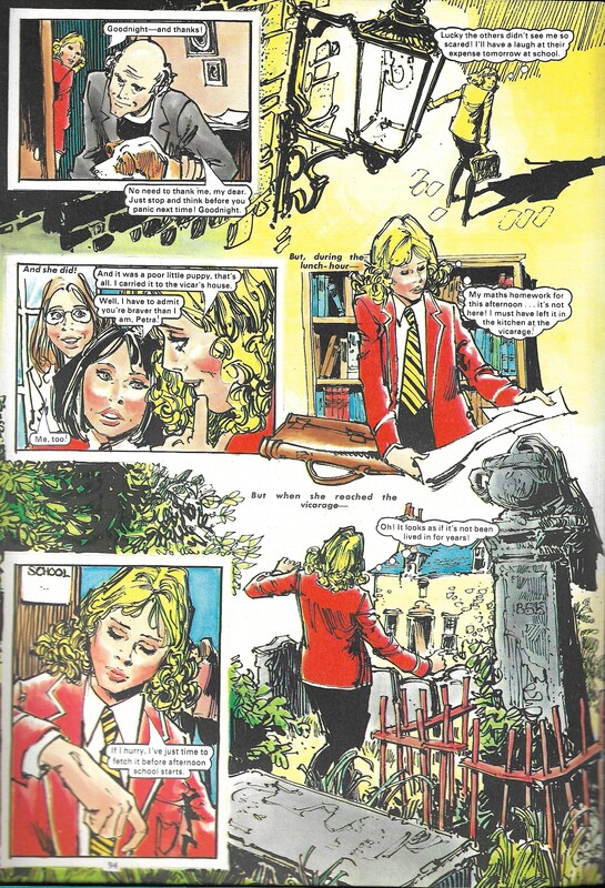
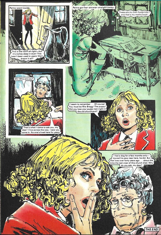
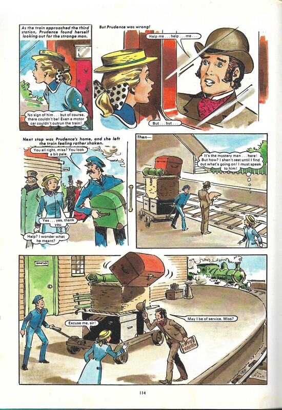
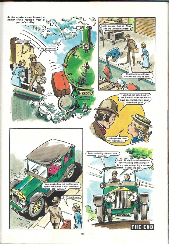
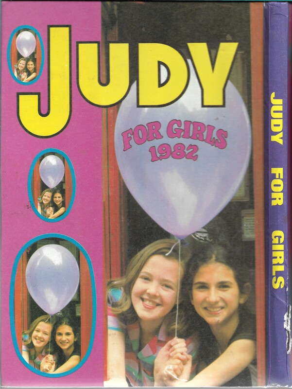
And now, something completely different. This 1982 annual is for the British "girls magazine" Judy, and a what an odd thing it is. Mostly comic strip short stories, but I was surprised at how dark and judgemental they are, especially for a magazine aimed at 10-12 year olds! Not just mean-girl-at-school-gets-her-come-uppence, but actual death and hell-fire. There's a healthy dose of the supernatural, and the same plot twists get used multiple times. I didn't read this as a kid, and looking at this sampler-set, I suspect I would have eaten it up.
 This collection of knitting and crochet patterns is a little different, as instead of being published by a yarn manufacturing company, it's from a soap company - to be specific, Lux Soap, which wants you to use Lux to wash all your woollens. There are several stylistic differences between this book and the ones published by Patons and Baldwins which are roughly the same age. This book looks a little more slick, with larger print, and the models look more like professional models and a little less like locals the photographer calls on when needed. It would be interesting to know what the process was for sourcing knitting patterns at this time - did "ladies magazines" and advertising booklets like this have their own designers, did they source from yarn companies, was there a pool of independent designers? Because if not published by a yarn company, there doesn't seem to be any consistency as to whether a patterns specifies a brand of yarn or not. It makes sense for Lux not to specify one brand of yarn in its patterns, as it is trying to convince you that it is perfect to clean all yarn brands and types. However, it does contain a mixture of patterns with no specific brand and with branded yarn recommendations. So how did they get the patterns? Are they reprinting with permission from other sources? Soliciting? Is there an agent for knitting pattern creators? It's the little mysteries like this that are part of my fascination with vintage magazines. Being essentially a branded booklet, there are few ads, and those are for Lux soap, with the exception of the final page which has an ad for Clark's and Coate's threads. "Anchor" stranded embroidery cotton has been around for a long time! 52 pages (including the cover pages) with 15 photographs (plus 2 on the covers) - compare the models here with those in the 'Lacy Jumpers' patterns from 1933 to see what I mean about the professionalism of the models. Only a few ads, but there are several "helpful hints" that really want you to use Lux. Also, the individual styles don't carry names, which is a change from what we've seen so far. Also, there are some lovely hats to be seen on the models.
I really don't know what to say about that colour name. Different times, sure but... sigh. No, today I don't have words. You can assume I'm not ok with it, and fill in the emotional maelstrom yourselves. And yes, I did consider *-censoring the word.  Today we're going back to November 2014 - three months into World War 1, although that doesn't seem to have influenced the contents of this periodical, possibly because it is a quarterly, and would be the first issue put together after the declaration of war. This collection of "fancy work" is definitely from the age where a young woman would work for years to make fancy linens for her 'glory box' before getting married, and presumably middle class women who didn't work and who had servants to see to the household chores and child care, would continue to fill their days with making more of these carefully decorated items. It's a good reminder of the real value of lace, historically speaking - time consuming and labour intensive! This is definitely showing its age; I had to carefully remove mildew powder from most of the pages, many of which are still slightly stained. At some point someone cut out pages 15 to 18; going by the contents list, they were cutting out the patterns for "The Gem Lace". Unfortunately this means that the patterns before and after it are now incomplete. I found it fascinating that the patterns for the knitted coat and knitted 'ladies blouse' have no sizing measurement. So not only is it one size for all, until you've knitted it up, you don't know what size that it. This also has something I've not seen before, and I'm not sure why it was done - the photographs of the model for the fascinator and the theatre wrap and bonnet have her face replaced with a drawing. It's subtle, and surprisingly easy to not notice that the rest of the picture is actually a photograph. I wondered if it was a social status thing - actresses at this stage were more socially acceptable, but there was still a sense that theatre people were not exactly "nice" and it's possible that being photographed for commercial purposes may have has a similar ambiguous status. But there are other models in the issue, and their faces are able to be clearly seen, and I'm certainly not aware of any social stigma associated with photographic modelling at the time. Another mystery thrown up by this publication comes from one of the adverts, which introduced me to an art form I have never heard of before: French pen-painting. Searching online has not been too enlightening so far; as far as I can tell, it uses oil paints with a 'special pen', and was done on a variety of materials, including ceramics and silk. There is a book in the Australian National Library from 1919 that describes the technique, so I'll have to see if the State Library can arrange an interlibrary loan for me to look at. I will keep you posted on this lost Edwardian art form! This was printed in England - the back cover gives "Printed for the Proprieters, MacDonals and Martin, 6 Essex Street Strand, London, W.C. by the Classic Colour Press, Reading, aand Published by Horace Marshall & Son, 125 Fleet Street London E.C." but looks to have been sent to Australia by subscription. As well as patterns, it has an "Editorial Chat" - this time it is a discussion about the difficulty of writing crochet patterns so as to be clear and easy to follow. Contents are:
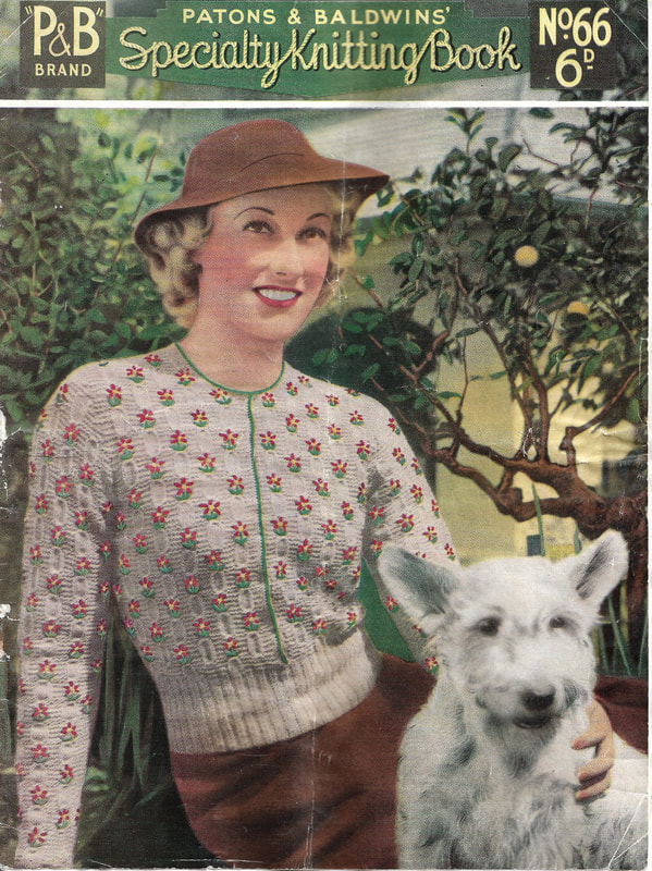
 Another book of knitting patterns from Patons and Baldwins, and like No. 66, it has no publication date, but going by the hairstyles and fashions, I'm guessing it dates to the 1930s. I don't know how often these were published, but this one is firmly in the Winter Knits category, and has patterns for men as well as women. 24 pages, with 10 internal photographs, including one showing a close-up of a stitch pattern detail. It has a credit for the cover photographs: "Illustrations of Mount Buffalo scenes on Back Cover by courtesy of Victorian Railways." It also refers to the style of model on the front cover: "Note the headband; everyone seems to wear these on the Continent." I'm interested to find out when having multiple sizes for each pattern became A Thing - this is another collection where most of the patterns are in one size, and presumably people understood how to adapt the patterns to their size. Unlike the later pattern book already posted, this gives the colour of yarn originally used. Patterns in this book are:
To see the pictures full size, right click and select 'view image'.
Specific brands of yarn aren't always stated - presumably as a seller of multiple brands, John Martin's was happy to leave it to the individual purchaser to decide. It also mentions that demonstrators were on hand to help you out if you got stuck, in their Art Needlework School on the third floor. I'd love to know how long that survived. Patterns to knit are all intended for men (although it isn't explicitly stated, one assumes service men) and are:
To see the pictures full size, right click and select 'view image'.
 This 8 page booklet is slightly larger than A4 size, and given how flimsy it is, it has survived in remarkably good condition. The cover states: "Owing to Great Demand - Reprinted from 'Everylady's Journal' October, 1932." It's not clear if the date is the original print date of the source material, but the last page has an ad advising to order the November issue of "Everylady's Journal" now, so I assume it is the date this was printed. There are no other dates, just a printers line on the last page: "Printed and Published by Fitchett Brothers Pty Ltd, 230-236 Stanley St, West Melbourne, C.3." which means I don't know how old the patterns were when reprinted - I would assume not more than two or three years old, possibly from the previous summer. There are 5 patterns, and somewhat confusingly, they jump pages to continue, leap-frogging each other. I don't know why this was done - it would make sense to keep the patterns continuous, and I don't see any benefit in layout terms, other than that there is a photograph on each of the first five pages, all in roughly the same place. There was obviously a trend at the time to give women's names to various styles, and I suspect they got re-used rather frequently. This time, they are:
"Mavis" looks the most comfortable, and her build, combined with her hairstyle and the style of the top, give her slight hunch to balance a sporty look. "Kathleen", however, looks half-starved and awkward. Allowed to stand, I think she'd have looked quite graceful, and the jumper would have fallen more elegantly, but in this awkward perch, there's something almost of the ugly duckling allowed to attend the ball about her (to mix my fairy tale metaphors). The model for "Frivolity" is not just perching on a table, she's having to turn three-quarters to face the photographer, and whilst she is obviously trying to look elegant and sophisticated, her blank expression and obvious discomfort make her look almost constipated. As if to make up for it, there is a sketch of a lithe, languorous exquisite lounging below it. The model for the "Breton" again has the awkward hunch of someone perching on an edge rather than firmly sitting down, but she's made it look almost natural by gazing off at some imaginary bird while she perches on the equally imaginary fence. Lastly, "Judith" who sensibly refused the photographer's penchant for table-perching and instead stands smiling comfortably at the camera. I don't know if it's the smile - real, but not modern-model-dazzling - the bobbed, uncurled hair or the bracelet worn above the elbow, but if someone told me she was a barmaid or a factory girl, it wouldn't have surprised me. That's the odd thing about fashion - why should one top make you think "middle class, maybe a teacher until she married" and another "nice working class girl", when they are all advertising to the same market? I simply don't know enough about the fashions and expectations of the time to know if my feelings are in any way accurate, so please don't quote me! To see the pictures full size, right click and select 'view image'.
Including the covers, there are 28 pages in total, 9 with photographs. Some of the pages have pencil marks, but the paper is so fragile I'm reluctant to try to erase them. The patterns are for:
|
Author
Anwyn is a hack with a scanner and a love of vintage magazines. ArchivesCategories
All
|


 RSS Feed
